Basics of Oil Pastel
Oil pastels are a vibrant and versatile medium perfect for creating realistic food art. They consist of pigment mixed with a non-drying oil and wax binder, resulting in a creamy, buttery consistency. This unique composition makes them ideal for blending and achieving the rich, varied textures found in food.
To start with oil pastel food art, it’s crucial to understand the fundamentals. Grip your pastels correctly – not too tight – to allow for better control of color application. Begin with light pressure for initial layers, increasing it gradually to build up color density and coverage.
When working with oil pastels, remember that the warmth of your hands can soften them. Use this to your advantage for smoother blending. However, if you prefer harder edges or finer details, keeping your pastels cool can maintain their shape and precision.
Experiment with different strokes. Short, brisk strokes can mimic the texture of certain foods, such as the rough skin of an orange. In contrast, longer, smoother strokes are great for creating the shiny surface of an apple or the smooth skin of a tomato. The direction of your strokes also matters, as it can contribute to the visual flow and realism of your food art.
Another tip is to keep a colorless blender handy. This tool can help you smooth transitions between colors without adding additional pigment, maintaining the purity of your color scheme. It’s especially useful for achieving gradients or subtle shifts in hues, often needed in food illustration to add volume and realism.
Choosing the Right Materials for Food Art
Choosing the right materials can make or break your oil pastel food art. Start by selecting high-quality oil pastels which offer better pigment saturation and layering capabilities. Look for brands known for their durability and consistency.
Choose pastels that blend well since smooth gradients are essential for realistic food textures. Pastels that offer a range of hardness can be beneficial too. Harder sticks are great for fine lines and details, while softer ones are ideal for filling large areas and blending colors.
Your choice of paper also impacts the final artwork. Heavyweight paper with a fine tooth provides a good grip for the pastels and holds layers well without getting oversaturated. Consider papers specifically designed for oil pastels or those that can withstand multiple layers without deterioration.
In addition, have a variety of blending tools on hand, like blending stumps, color shapers, or even your fingertips. They help smooth out colors and create seamless transitions which are vital in food art.
Lastly, a good sharpener will keep your pastels pointed for crisp lines and details that bring your food illustrations to life. With the right materials, you set the stage for oil pastel art that is as realistic as it is vibrant.
Color Mixing and Layering Strategies
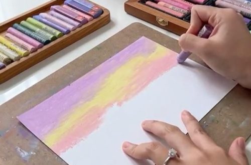
Mastering color mixing and layering is crucial in oil pastel food art. Begin with the base color, the dominant hue of the food item. Add layers gradually, using light pressure and a variety of colors to build depth. Color mixing on the palette isn’t necessary; blend colors directly on the paper.
For realistic effects, layer complementary colors for shadows and depth. Applying white or lighter shades can create highlights and enhance the food’s texture. Be mindful of the color temperature; warm colors can suggest ripeness or heat, while cool colors can imply moisture or freshness.
Remember to layer colors subtly. Sudden changes in color can look unnatural. Use a light hand and build up to the intensity you need. A common technique is to start with lighter colors and end with darker hues for shadows or details. This creates volume and makes the food item pop from the canvas.
Incorporate thin layers to avoid muddiness. With each added layer, the previous one interacts and combine to form new shades. It’s the delicate balance of layering that contributes to the realistic portrayal of food in oil pastel art. Through experimentation and practice, you’ll discover the right strategies to make your food illustrations come alive with color and dimension.
Texture Creation Techniques
Creating texture in your oil pastel food art is about mimicking the real thing. Start with observing. Look at your food subject closely. Notice how the surface appears. Is it smooth like a tomato, or bumpy like a waffle? Use this insight to guide your technique.
Use the tip of your pastel for fine lines. This works for fine textures, like the tiny seeds on strawberries. For larger textures, like orange peels, use the side of your pastel. Press down and twist slightly for that rough, dimpled texture.
Layer colors to build texture. Start with a base layer and add different hues on top. This brings out the natural variations found in foods. Use light strokes for delicate textures and press harder for bolder ones.
Blending plays a big role in texture too. Blend lightly for a soft, subtle look. Use a stronger touch for a more pronounced texture. Remember, don’t over-blend. You want to keep the distinctness of the textures.
Don’t forget to step back. Look at your art from a distance. This helps you see if the texture looks real. Adjust your strokes and pressure as needed. With practice, your techniques will help make your oil pastel food art look as real as possible.
Highlighting and Shading for Depth
Highlighting and shading are vital in creating depth in oil pastel food art. These techniques give your subject a three-dimensional look that is essential for realism. Here’s how to incorporate these elements effectively into your artwork.
Start by identifying the light source in your composition. This will guide you in placing highlights and shadows appropriately. Areas hit by light will have highlights, while parts away from the light will be in shadow.
For highlights, gently apply light pressure with a pale color or white oil pastel. Keep these applications minimal to avoid a flat or washed-out appearance. Highlights should be subtle, imitating the reflective quality of real food surfaces.
Shadows come next. Choose a complementary or darker shade of your base color for shadowing. Apply it where the object would naturally cast a shadow. Be consistent with your light source to maintain the artwork’s realism.
Use your blending tool to soften the edges of your shadows. This creates a gradual transition from light to dark. Real food has soft shadows, not hard lines, unless under harsh lighting.
Remember, the contrast between light and dark is what gives the impression of depth. Adjust the intensity of your highlights and shadows, based on the form you want to achieve. More contrast will make the food look more dramatic and lifelike.
Practice these techniques on various food textures to see how light and shadow play differently on them. With highlighting and shading mastered, your oil pastel food art will have a lifelike appeal that truly stands out.
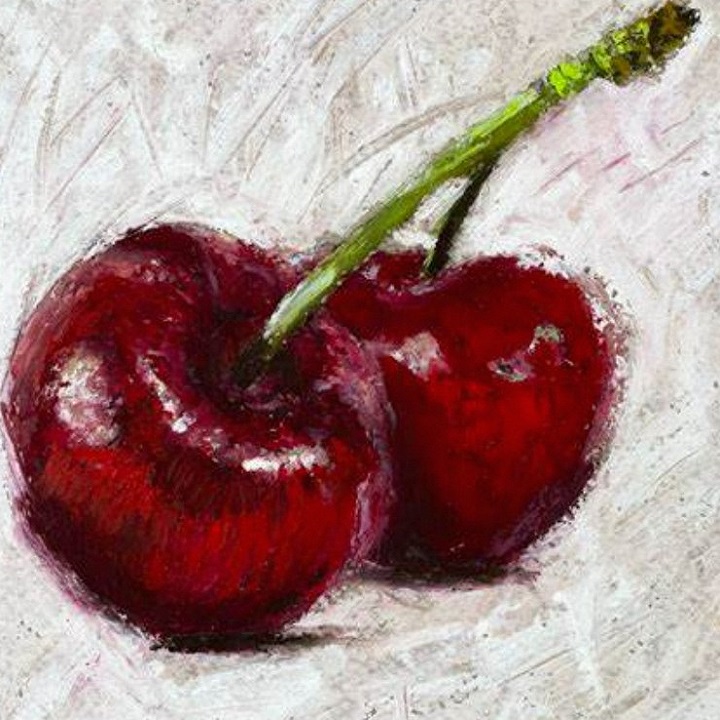
Step-by-Step Demonstration: Drawing a Piece of Fruit
Drawing a realistic piece of fruit with oil pastels can be a delightful project. Let’s walk through the process step-by-step for a basic piece of fruit, like an apple.
- Sketch the Outline: Use a light pencil to trace the basic shape of the apple. Keep the outline light as you’ll cover it later with oil pastels.
- Base Color Application: Choose your apple’s primary color and fill in the shape lightly. Use smooth, even strokes to get a uniform layer.
- Adding Mid-Tones: Layer in a slightly darker shade to start forming the apple’s curve. Apply the color where shadows naturally occur, on the sides and bottom.
- Deepening Shadows: Identify where the darkest areas are and use a complementary color to deepen the shadows. Gently blend without making the shades murky.
- Creating Highlights: Use a light yellow or white pastel to add highlights on the top of the apple. These represent where the light hits the most.
- Blending for Realism: With a colorless blender or your finger, softly merge the colors. Aim for a gradient transition between light and shadows.
- Adding Details: Outline the apple stem and use brown tones to color it. Use a darker color to shadow one side of the stem.
- Refining Edges: Check the edges of your fruit. Use a clean, sharp pastel to define the shape if necessary.
- Final Adjustments: Step back and review your artwork. Adjust the color intensity or sharpness of details where needed.
As you follow these steps, remember patience and layering are key. Go slow and build layers to add complexity to your fruit’s appearance. With practice, your skill in oil pastel food art will grow, and your artwork will start to look more realistic.
Fixing Common Mistakes in Oil Pastel Food Art
When creating oil pastel food art, mistakes can happen. Here are some tips to fix them.
Overworking the Pastels
Avoid layering too many colors which can lead to muddy results. If this occurs, scrape off excess with a knife and reapply base colors.
Incorrect Color Choices
If colors don’t match the food item, add a layer of the correct shade over it, blend gently, and refine.
Lack of Depth
Increase depth by reinforcing shadows and highlights. Darken shadows and brighten highlights where necessary.

Overuse of Black or White
Using excessive black can make the art look flat. Instead, use dark shades of the food’s colors to add depth. Similarly, use white sparingly for natural-looking highlights.
Smudges Outside the Lines
Common and distracting, they can be tidied with a pastel of the background color edged around the food item.
Remember, flaws in your art can be fixed with patience and practice. Keep a steady hand, and use the right techniques to correct any errors for a realistic rendition of oil pastel food illustrations.
Protecting and Preserving Your Oil Pastel Artwork
After you finish your oil pastel food art, it’s important to protect and preserve it. This ensures your artwork stays vibrant and undamaged over time. Here’s how you can keep your oil pastel art in top condition.
Use a Fixative:
Spray a light coat of fixative over your artwork. This helps to seal the pastels and prevent smudging. Be sure to follow the instructions on the fixative and apply it in a well-ventilated area.
Frame Under Glass:
Framing your artwork under glass not only showcases your work but also protects it from dust, moisture, and direct sunlight. Use a matte or spacer to prevent the pastel from touching the glass.
Handle with Care:
Always handle your oil pastel art with clean hands or wear cotton gloves. This prevents the transfer of oil and dirt to the paper.
Store Properly:
If you’re not displaying your art, store it flat in a cool, dry place. Use acid-free paper to separate your artworks and avoid using plastic which can trap moisture.
Keep Away from Heat:
Avoid hanging or storing your art near heat sources. Heat can soften the pastels and may cause colors to fade or blend unintentionally.
Regular Checks:
Inspect your art regularly. Look for any changes in color or texture and take steps to rectify any issues you find.
By taking these steps, you can help ensure that your oil pastel food art remains as fresh and appealing as the day you completed it.