Part 1: Introduction to Calligraphy with the Ink Pen
Calligraphy with the ink pen is a beautiful and elegant art form that requires patience and precision. It’s a timeless craft that can be mastered with the right techniques and tools.
1. Selecting the Right Pen and Paper:
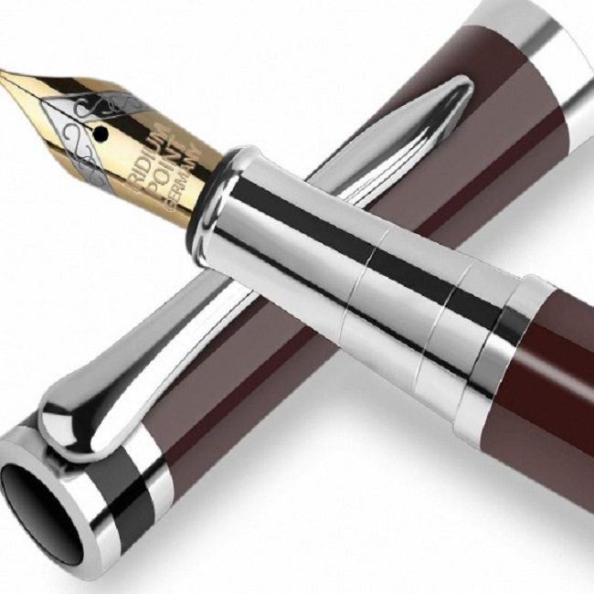
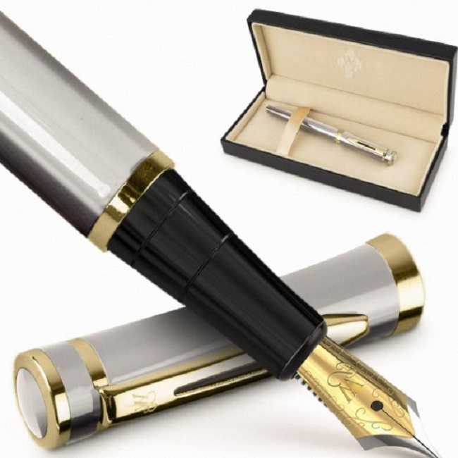
The foundation of beautiful calligraphy lies in the quality of your tools. Invest in a high-quality fountain pen with a flexible nib, allowing you to effortlessly transition between thick and thin strokes, a hallmark of elegant calligraphy. The nib’s flexibility is crucial for achieving the desired variations in stroke width, adding depth and character to your writing.
When selecting paper, opt for a smooth, heavyweight variety that provides a firm surface for the ink to glide smoothly. This prevents bleeding and ensures clean, crisp lines, enhancing the overall readability and aesthetic appeal of your calligraphy. Look for paper specifically designed for calligraphy or illustration, as they often have a slightly textured surface that enhances the ink’s flow and prevents feathering, ensuring a consistent and enjoyable writing experience.

2. Understanding Calligraphy Styles:
The world of calligraphy offers a rich tapestry of styles, each with its own distinct characteristics and aesthetic appeal. Explore options like italic, copperplate, and gothic to discover the one that aligns with your artistic sensibilities and the desired outcome of your work.
- Italic: Known for its flowing, elegant lines, italic calligraphy is often used for formal documents and invitations. Its slanted strokes and connected letters create a sense of rhythm and harmony.
- Copperplate: Characterized by its ornate, highly stylized forms, copperplate calligraphy is frequently used for engraved invitations and certificates. Its intricate flourishes and intricate details make it a popular choice for special occasions.
- Gothic: With its angular, bold strokes and pointed arches, gothic calligraphy exudes a sense of medieval grandeur. Its dramatic appearance is often used for religious texts, book covers, and architectural elements.
Experiment with different styles to find the one that resonates with you and your project’s requirements. Practice is key to mastering the nuances of each style and developing your own unique calligraphic voice.
Part 2: Learning Different Calligraphy Techniques
Calligraphy requires mastering specific techniques to achieve beautiful and consistent lettering.
1. Mastering the Basic Strokes:
The foundation of calligraphy lies in the mastery of fundamental strokes. Practice diligently to develop muscle memory and control over your pen’s movements. Begin with the upward and downward strokes, honing your ability to create consistent, even lines. Pay attention to the pressure applied to the pen, as it directly influences the thickness and thinness of the strokes. Next, delve into hairlines, those delicate, fine strokes that add character and depth to your calligraphy. Practice creating smooth, consistent hairlines, ensuring they are even in width and maintain a consistent angle.
Finally, tackle loops, graceful curves that connect letters and add a sense of flow to your writing. Experiment with different loop shapes and sizes to find the ones that suit your style and the specific calligraphy style you’re practicing. Remember, consistency is key in mastering basic strokes. Regular practice will refine your technique and build the confidence needed to tackle more complex elements.
2. Understanding Proper Letter Formation:
Calligraphy is not merely about creating individual strokes; it’s about forming letters that are uniform, visually appealing, and true to the chosen style. Each letter has a unique structure, composed of individual strokes that intersect, form loops, and extend beyond the baseline. Understanding this underlying structure is essential for maintaining consistency and elegance throughout your writing.
Pay close attention to the individual strokes that make up each letter. Observe how they intersect, how loops are formed, and how ascenders and descenders extend beyond the baseline. This knowledge will enable you to create letters that are harmonious and visually pleasing.
Practice writing each letter multiple times, focusing on maintaining the correct proportions and angles. Pay attention to the spacing between letters and words, ensuring they are harmonious and visually pleasing. A well-spaced composition enhances the overall readability and aesthetic appeal of your calligraphy.
Remember, consistency is key in letter formation. By understanding the underlying structure of each letter and practicing diligently, you’ll develop the skill to create beautiful, uniform calligraphy that reflects your chosen style.
Part 3: Developing Your Calligraphy Skills
After mastering the basics, it’s time to focus on refining and polishing your calligraphy skills.

1. Practicing Spacing and Layout:
The art of calligraphy extends beyond individual strokes and letter formation. Proper spacing and layout play a vital role in creating harmonious and visually pleasing compositions. Pay attention to the distance between letters, ensuring they are neither too close nor too far apart. Consistent spacing contributes to a sense of balance and readability. Experiment with different spacing techniques, such as optical spacing, which takes into account the varying widths of different letters. Additionally, master the placement of ascenders and descenders, the portions of letters that extend above and below the baseline. Ensure they align consistently, avoiding crowding or unevenness. A well-balanced layout enhances the overall aesthetic appeal of your calligraphy.
Practice creating different layouts, such as centered, justified, or ragged right. Experiment with different line lengths and margins to find the arrangement that best suits your content and desired effect.
2. Experimenting with Flourishing:
Flourishing is a captivating technique that elevates calligraphy to new heights. By adding decorative elements to your writing, you can transform simple text into visually stunning works of art. Experiment with various flourishing techniques, such as swashes, loops, and embellishments. Swashes are graceful, elongated strokes that can add a sense of movement and dynamism to your calligraphy. Loops are circular or oval-shaped flourishes that can create intricate patterns and add visual interest. Embellishments, such as serifs, curls, or flourishes, can be used to enhance the overall aesthetic appeal of your writing.
Observe how flourishes can enhance the flow and rhythm of your calligraphy. A well-placed flourish can create a sense of balance, emphasize key words or phrases, or simply add a touch of visual interest. Experiment with different flourishes to find those that complement the chosen calligraphy style and the overall mood of your piece.
Remember, moderation is key. Flourishes should enhance the text, not overpower it. Balance the flourishes with the main lettering, ensuring they do not detract from the readability or clarity of the message.

Part 4: Enhancing Your Calligraphy with Ink and Color
Ink and color can add a unique touch to calligraphy, elevating the visual impact of the artwork.
1. Choosing the Right Ink:
The quality and type of ink you select significantly influence the final outcome of your calligraphy. Traditional black ink remains a popular choice for its timeless elegance and versatility. However, don’t be afraid to experiment with different inks to achieve unique effects and styles.
Colored inks offer a vibrant and playful alternative to black. Explore a wide range of hues, from bold primaries to subtle pastels, to infuse your calligraphy with personality and creativity. Metallic inks, such as gold or silver, add a touch of luxury and sophistication to your pieces, making them ideal for special occasions or formal documents.
Consider the properties of different inks, such as flow, drying time, and sheen. Some inks may be more suitable for specific paper types or writing styles. Experiment with various inks to discover the ones that align with your artistic vision and desired outcomes.

2. Incorporating Color:
Calligraphy doesn’t have to be confined to monochromatic palettes. Adding color can enhance the visual appeal of your pieces and create a more dynamic and expressive style. Watercolor provides a soft, subtle way to introduce color to your calligraphy. Use a brush to apply washes of color to the background or specific letters, creating a sense of depth and dimension. Gouache, an opaque water-based paint, offers a bolder and more vibrant approach to adding color. It’s ideal for creating solid blocks of color or detailed patterns.
Colored inks can also be used to accentuate certain letters or create entirely colored compositions. Experiment with different color combinations to find those that resonate with you and the desired mood of your piece. Consider using complementary colors for a harmonious effect or contrasting colors for a more striking impact.
Mastering calligraphy with the ink pen requires dedication, practice, and a deep understanding of the art form. By selecting the right tools, learning techniques, developing skills, and experimenting with ink and color, you can create stunning calligraphy pieces that showcase the timeless beauty and grace of this art form. So, pick up your ink pen and get ready to embark on a journey of mastering calligraphy.
